Beyond the Logo:
Walmart’s Rebrand as a Reflection
of Evolution & Authenticity
Brian Fallers | Chief Brand Officer
Rebranding is often seen as a cosmetic exercise—a new logo, a refreshed slogan or a redesigned store. But for companies like Walmart, rebranding is far more than surface-level changes. It reflects a deeper shift in identity, culture and purpose. As companies and their cultures evolve, so too must their brands, ensuring they remain authentic and relevant in a changing world.
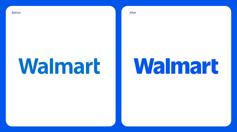
Image credit: https://corporate.walmart.com/
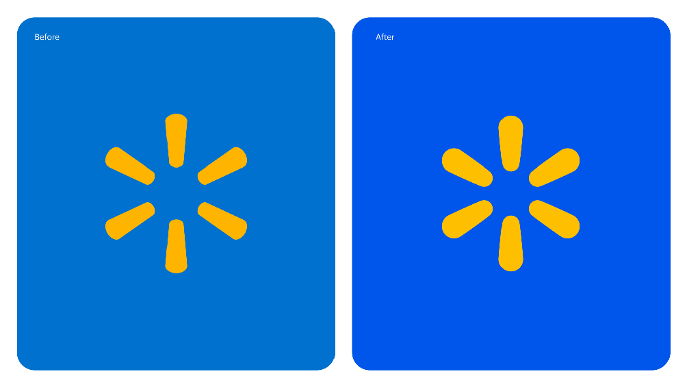
Image credit: https://corporate.walmart.com/
Walmart has long been associated with affordability and accessibility, embodying the Everyperson archetype. This identity — focused on connecting with everyday consumers and making goods available to all—has been the foundation of its success. However, as the retail giant has grown and the market landscape has shifted, Walmart’s brand needed to evolve. Today’s consumers expect much more than low prices; they value sustainability, inclusivity and seamless digital experiences. Walmart’s rebrand reflects its commitment to meeting these expectations.

Image credit: https://corporate.walmart.com/
At its core, Walmart’s rebrand highlights the company’s cultural evolution. The retailer has made strides in digital transformation, sustainable practices and community engagement, signaling a shift from simply being the “low-price leader” to a company that cares about its impact on people and the planet. This shift aligns with the Caregiver archetype, emphasizing nurturing and responsibility—qualities that resonate with modern consumers.
The visual elements of the rebrand also tell a story. The wordmark, inspired by Sam Walton’s classic trucker hat, brings a modern touch with a custom font that differentiates Walmart from the crowd. The spark, a core element of Walmart’s identity, exudes energy and acts as a guiding beacon across all facets of the Walmart experience. The updated color palette, True Blue (coincidentally, precisely what we call our blue – the “True” works better in our instance for obvious reasons) and Spark Yellow, builds on the retailer’s heritage while introducing a fresh vibrancy to keep the brand contemporary. Additionally, the tone of the rebrand—relatable and approachable—reflects the millions of customers Walmart serves, as seen in its brand voice, illustrations and photography.
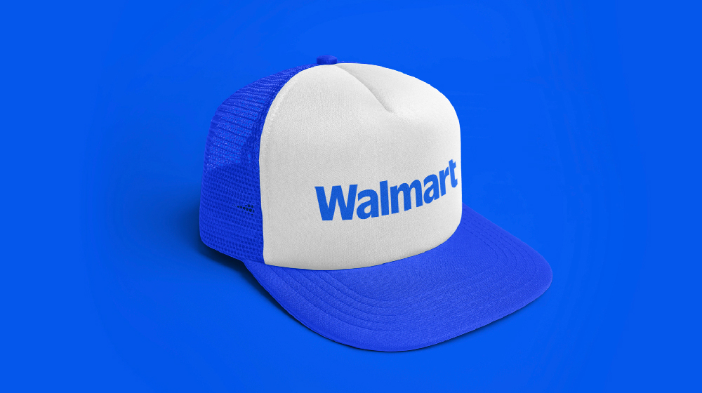
Image credit: https://corporate.walmart.com/

Image credit: https://corporate.walmart.com/
Rebranding is not merely about aesthetics; it’s about recalibrating a brand’s purpose to align with its values and the evolving needs of its audience. We recently performed a similar recalibration, resulting in a minor refinement and greater embrace of our Sage archetypal DNA. For Walmart, this means balancing its Everyperson roots with the Caregiver’s ethos, staying authentic while adapting to cultural and market changes. This rebrand is a reflection of Walmart’s journey and its vision for the future.
As businesses navigate an era of rapid change, Walmart’s rebrand serves as a reminder that authenticity and evolution go hand in hand. A brand’s ability to adapt while staying true to its core can be the difference between merely surviving and thriving.
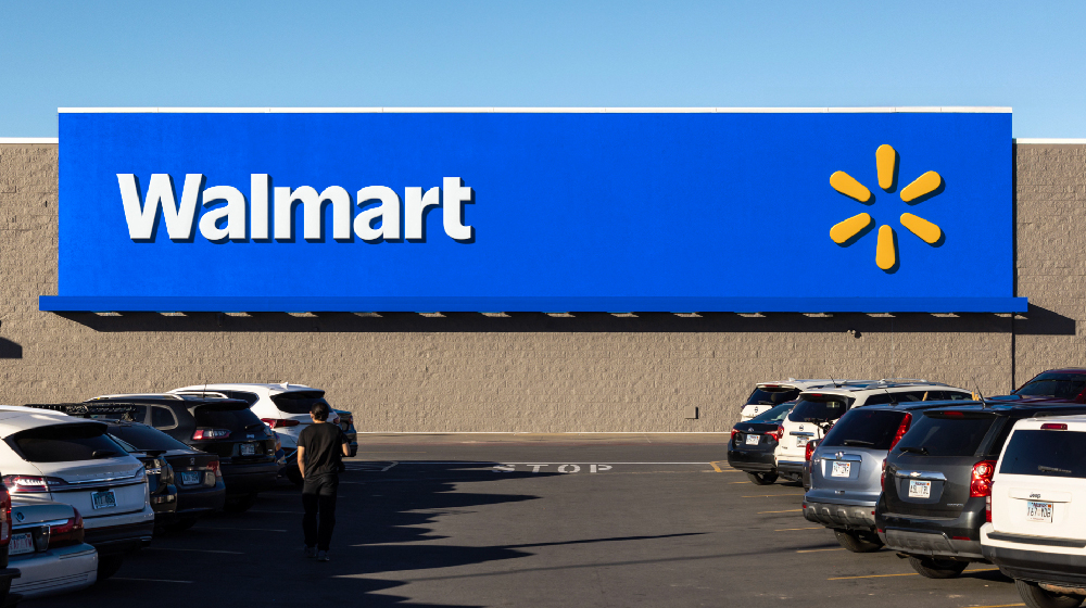
Image credit: https://corporate.walmart.com/
Is your brand ready for a refresh? Contact us today for a complimentary consultation. We’d love to share some actionable insights that will help your company adapt to today’s ever-changing consumer marketplace. No strings attached.
Brian Fallers
Truelio’s Chief Brand Officer
brian.fallers@truelio.com
Founder of Paradigm


