
CrossleyShear Wealth Management
Vertical: Wealth Management / Financial Services
For over two decades, CrossleyShear Wealth Management has served as a premier financial planning team dedicated to helping provide clients and families with innovative financial solutions and wealth management strategies. In the fall of 2017, CrossleyShear was seeking to redevelop their brand so it would better mirror its culture and client-centric planning approach. Working closely by their side, we created a marketing plan and new brand identity that visually and verbally represented their client promise and values while remaining closely aligned to their strong regional connection.
Above & Beyond Results
Features-Best Visual Appeal: Aesthetic for Websites
Corporate Identity: Logos for Design/Print
Web Traffic
715
Since the rebranding, yearly website traffic has increased 715% to 29K users per year.
Solutions Provided
• Paradigm Brand and Culture Assessment
• Archetypal Mapping
• Logo
• Tagline
• Advertising
• Marketing and Communications Development
• Corporate Statements (Mission and Vision)
• Brand Guidelines
• Event Support
• Marketing Strategy
• Public/Press Relations
• Web Site Management and Development
• Promotional Merchandise Strategy and Fulfillment
• Business Development Strategy and Development
The Challenge
As a premier Raymond James financial planning and wealth management firm, CrossleyShear Wealth Management (CrossleyShear) needed a brand refresh. Its previous identity was outdated and insufficient in demonstrating the company’s highly successful client-centric care approach and planning process. CrossleyShear partnered with Truelio seeking to develop a new brand that was not only contemporary but reflective of the company’s core values and corporate culture.
Before:
Our Solution
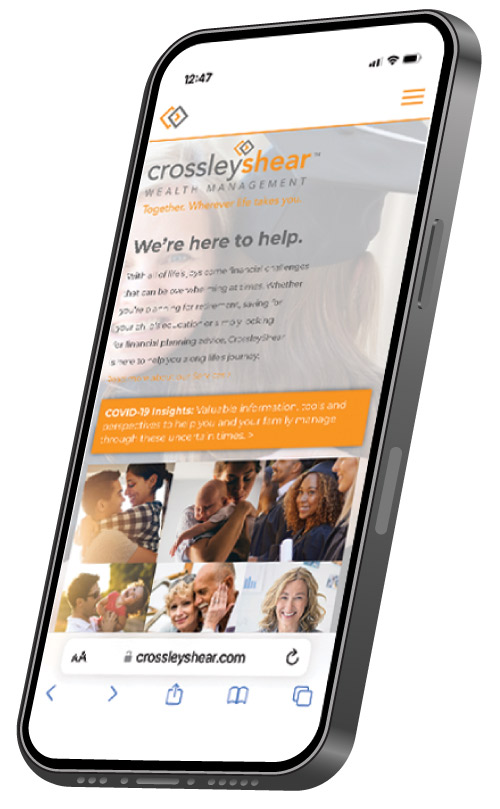
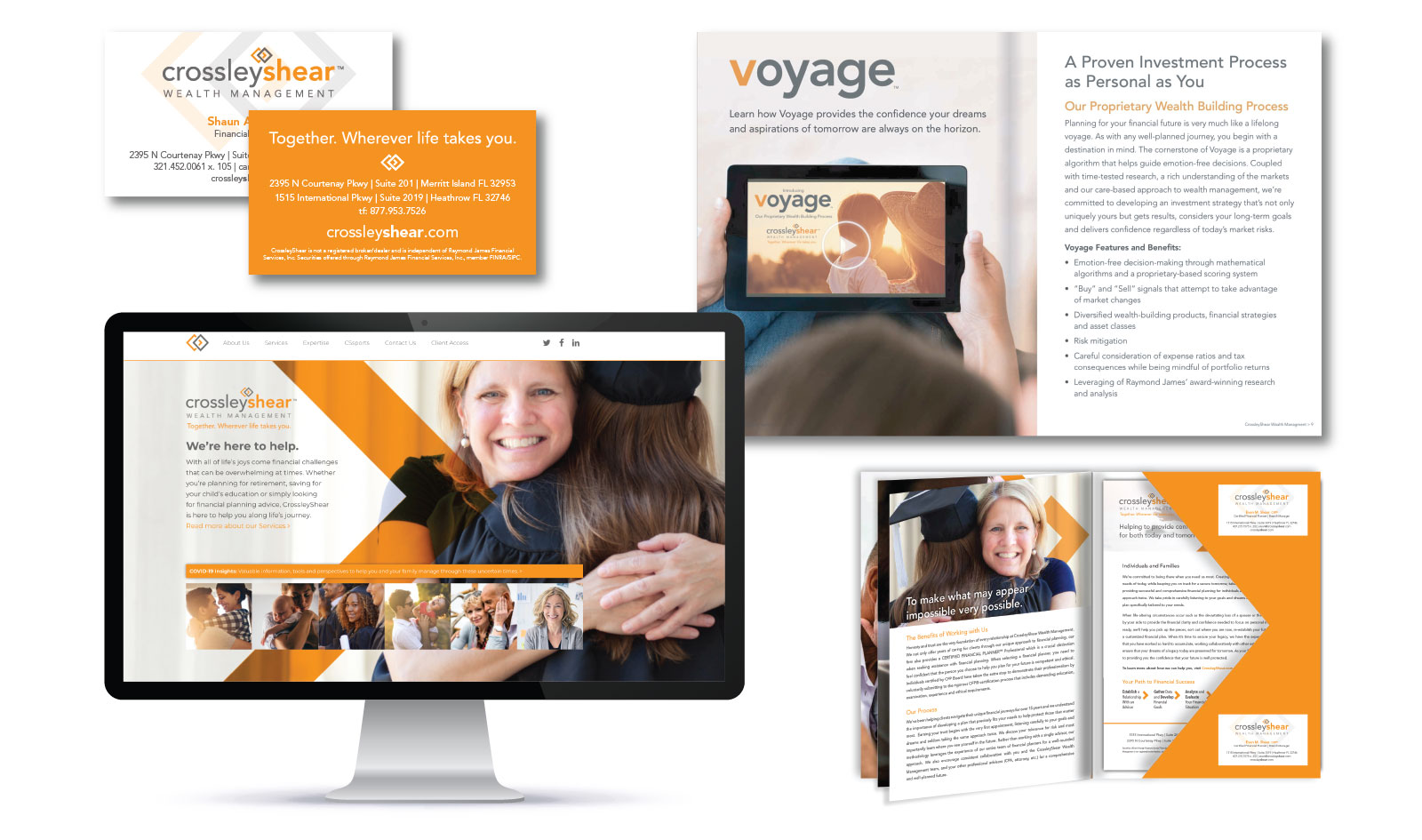
Utilizing the Paradigm brand and culture assessment, Truelio collaborated with CrossleyShear on a comprehensive rebranding initiative founded upon the company’s archetypal makeup. The end result was a vivid and energetic brand identity that aptly represents CrossleyShear’s culture and client commitment. The company’s enhanced logo includes two diamonds linked together –symbolic of the value and importance partnership plays in the organization’s success. While the color gray perfectly represents the seriousness of financial stewardship, Truelio integrated orange as an anchor color representing its regional connection to Florida and the energetic brightness the state embodies. Orange was also strategically selected to represent the optimism CrossleyShear demonstrates towards its clients. In addition to the logo, the broad rebrand initiative included a supporting tagline, new website, redevelopment of the company’s entire marketing communication suite, enhanced advertising and incorporation of PR as a supporting channel.
After: